
With high competition in the market, it becomes crucial for brands to explore all possible ways they can create a differentiating image for themselves, to hold a strong position in their respective industry. This creates a formidable challenge for marketers to formulate strategies that work best for their brands. In this scenario, the strategists have identified an effective marketing tool by understanding colour psychology, which influences consumer behaviour by targeting their subconscious mind.
Humans being driven by emotions; their purchase decisions are often influenced by the way a brand makes them feel. Retailers have acknowledged the correlation between the brand’s colour palette and its respective impact on consumer behaviour, to build stores that enable brand recognition and drive sales, simply by connecting with the customers through colours. Studies indicate that 85% of the customer’s purchase decision is influenced by colour. It is also stated that the colour of the brand logo is the first thing that a person intuitively notices and up to 90% of the initial brand impression is regulated by the colour scheme used by brands. Although each person has an individual perception of different colours, this article helps create a general outline for marketers to develop colour associations with the brand identity.

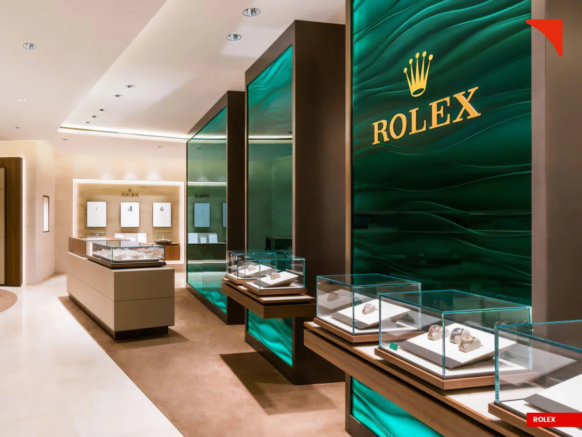
The psychology of colour can be comprehended by assigning certain attributes and personality specific to the colour. The primary colours include Red, Yellow, and Blue while the secondary colours include Orange, Green, and Purple. The colour red can generate strong emotions such as power, energy, and passion, as well as negative feelings like anger and danger. Red is therefore used by brands like Ferrari to cultivate excitement amongst people. Blue, on the other hand, represents serenity, reliability, and security, making it the most widely used colour across brands, especially IT sector and financial institutions.
A few examples include Facebook, Samsung, and Intel. Blue is considered a safe colour, but even then, if not used properly, it can conjure emotions such as sadness and can be considered unappetizing, therefore, it is not the top choice for food brands. Yellow is the colour of joy, happiness, and positivity; brands such as McDonald's use this colour in their outlets to build a feeling of warmth as people spend time with their family and friends. Other sought-after colours include Green which has become synonymous with being eco-friendly, Orange which represents confidence and energy and Purple which is the least found colour in nature and hence, symbolizes royalty, wisdom, and imagination.
Besides the above-mentioned colours, there are neutral colours like the classic Black and White. Black is used by luxury brands such as Chanel and Puma to depict sophistication, power, and authority while White portrays purity, cleanliness, and simplicity. White enables marketers to highlight the absence of any colour while complimenting them and is widely used by brands like Apple, Zara, Zudio, and Adidas in their retail stores to enhance the shopping experience of consumers.
Strategic Selection of the Colour Palette for your Brand

When it comes to choosing a colour scheme for the brand, even minor ignorance can lead to major losses as in the case of Pepsi who painted light-blue colour on their vending machines in the 1950s East Asia, ignorant of the cultural belief that this colour symbolizes mourning and death in that region, which eventually led to huge losses in their sale revenue. The very existence of brands is to serve customers; therefore, it is crucial to understand the target audience, their demographics, preferences, cultural norms, and needs.
Craft the brand’s personality and communicate its attributes to the target segment through colour associations. For instance, Orange is associated with inexpensiveness, therefore, this colour is strategically used by Amazon to be identified as an affordable brand for all. Brands must match the colour palette with its attributes and be consistent with the colour code to enhance brand recognition. The same colour can be perceived differently based on the environmental setting, for example, Black represents power when used by Sports Brands such as Nike, whereas, if used in healthcare, black can be associated with death, creating a feeling of discomfort. Thus, systematic knowledge regarding the impact of colour on mood and behaviour is vital for brands to connect with consumers and influence their purchase decisions.
Elevating Retail Experiences through The Power Of Colours
The visual appearance of a retail store plays a major role in the consumer decision process with about 93% of the shoppers focusing entirely on the visual appeal while making a purchase. The colour scheme for interior design should align with the brand’s personality, ensuring an immersive experience and navigating consumer interactions within the given space. The store ambiance can be stimulated depending on the colours used.
Monochromatic colours such as black and white create an under-stimulated, natural, elegant & calming environment, whereas a highly saturated, high-contrast colour palette including bright red, yellow, and green can lead to over-stimulation of the respective surroundings. The strategic application of colours on certain specific sections within the store enables the retailers to improve the prospects of getting a favourable consumer response.
For instance, Yellow and Orange are uplifting, energizing, and welcoming colours making them suitable for the entrance area. Bright and vibrant colour such as Red is used on displays and other focus areas in the store, as it draws attention. The combination of Blue-Green creates a calming effect, building trust, confidence, and reliability, and hence, is used near the payment section of the store. Therefore, aligning colour choices is essential to ensure the intended emotional response of the customers which helps brands connect with the target audience and serve its purpose of crafting a valuable retail experience.
Conclusion
In summary, brands should invest resources into building a retail identity that resonates with the target audience. The emerging field of colour psychology serves as a marketing tool, which helps build brand associations and can act as a differentiating factor amongst the competition.
Designing the retail spaces based on the analogy between colour psychology and consumer behaviour reinforces brand image by influencing the buyer’s subconscious mind. From establishing recognition to driving sales, the strategic application of colour theory stimulates favourable consumer response, and hence, facilitates the accomplishment of brand objectives.