When customers enter a retail outlet, they are not prepared to shop immediately. Instead, their mind is still processing the transition from a busy outside environment and adjusting to an in-store shopping experience. Considering this scenario, retail brands should avoid filling the entrance with too many posters, product stands, or promotional displays. If they do so, customers will not pay any attention and are more likely to ignore them.
This is exactly what’s termed as the ‘decompression zone” in layout planning. When brands understand how this space works, along with their customer behavior and preferences, they can seamlessly improve shoppers’ retail experience and positively impact their final buying decision, right from the moment a shopper walks in.
What is the Decompression Zone?
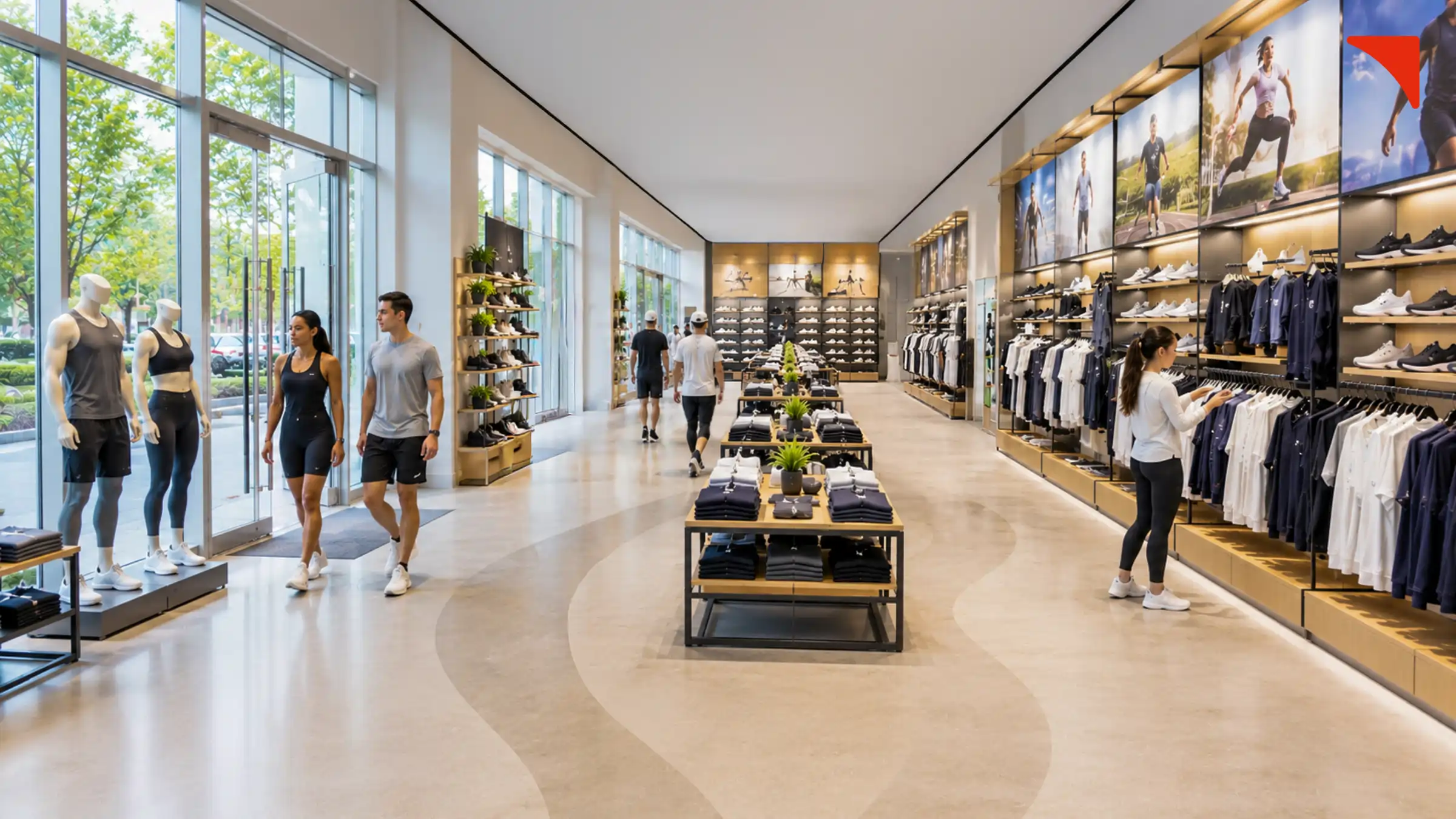
The decompression zone, in simple words, can be defined as the first 10 to 15 feet inside a store entrance. It is the area where customers adjust to the lighting, temperature, background music, and overall ambiance of the store. During these first few seconds of entering a retail outlet, shoppers usually focus on understanding their surroundings and further decide where to move next. This is the main reason why they usually ignore or do not pay complete attention to products or signs that are directly placed near or at the entrance.
Why is a Crowded Entrance a Problem?
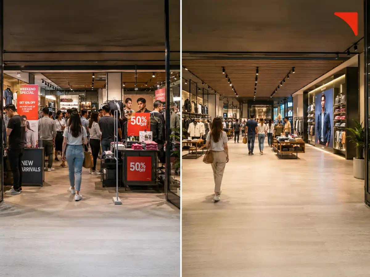
Even in 2026, many retailers believe that the front entrance is the best place to display important, newly launched, or high margin products. However, they often ignore the fact that when they place too many items near the doorways, it automatically makes the place feel more crowded and uncomfortable.
Customers who are planning to enter a retail outlet require an open space to slow down and settle into the shopping environment. Placing items at the entrance does not just make the space look small, but it also forces them to stop suddenly or move through tight spaces. As a result, they might feel stressed and lose interest in browsing. Or worse, they might decide not to enter the store.
Paco Underhill, a renowned psychologist, author, and retail expert, explained this through the “butt-brush effect.” According to this theory, when shoppers are bumped or brushed by any other customer while browsing in any part of the store, they will either move away quickly or even leave the store entirely.
The chances of customers getting bumped and brushed automatically increase when entry points are filled with too many products. Well, this is the exact reason why the decompression zone should feel open, clean, and welcoming instead of overwhelming and overloaded with displays and products.
Understanding the Rule of the Right
Once the customer has moved through the decompression zone, their next action is usually very predictable.
Various studies show that most shoppers naturally turn right after entering the store. This behavior in retail is what is termed as the Rule of Right. Due to this natural movement pattern, the area on the right side of the entrance automatically becomes one of the most important sections of the retail outlet.
The Importance of the Power Wall
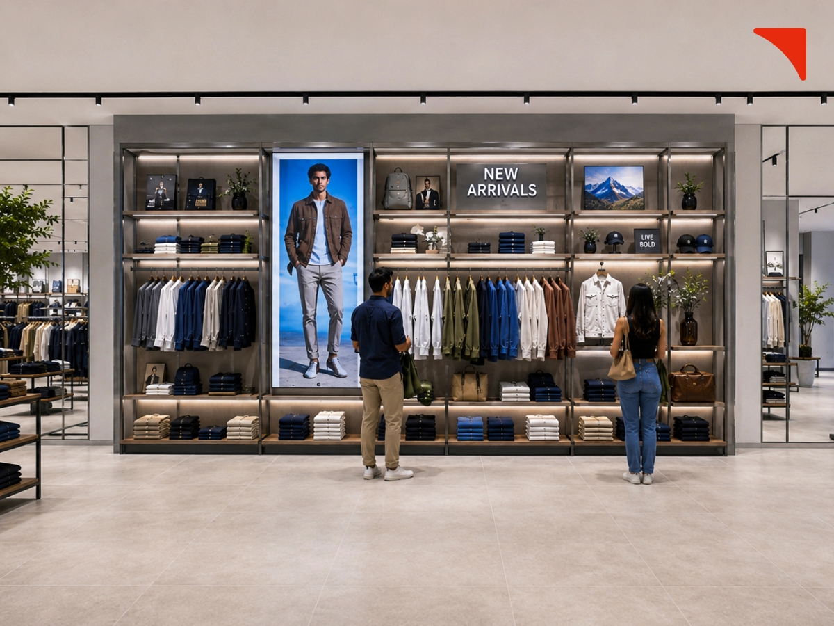
The first major display witnessed by the customer on the right side is termed as the power wall. This area creates the shopper’s first real impression of the store and the brand as well. Hence, it should always be used in a careful manner.
Mentioned below are a few things that retailers can consider displaying on the power wall:
Now, because this area gets the most customer attention, it should look visually appealing and easy to understand as well. Brands can consider executing strong/appropriate lighting, creative displays, and bold graphics. This will automatically appeal to the eyeballs of customers, encourage them to take a pause, and closely explore and engage with the available products.
The rule of right is an important part of a well planned store layout design as it helps brands address two problems at once: improving product visibility and naturally guiding customer movement throughout the store.
Creating the Perfect Customer Journey
Strategic retail store layout planning is all about designing spaces that naturally guide customers and help them seamlessly navigate the outlet. Once the customer has moved towards the right side, the executed layout should automatically encourage them to continue exploring the rest of the space in an organized and comfortable manner.
Here are a few tips mentioned below that can be used by retail shop owners in order to establish a perfect customer journey.
Speed bumps can be defined as small product displays or visual breaks that are often utilized by retailers just after the power wall. These displays help in slowing customers down and further encouraging them to look at additional products that they did not even plan to buy. In other words, speed bumps help increase product discovery by boosting visibility and improving customer engagement.
Successful retailers have understood this trick, and they are the ones that utilize it the most: placing high demand products towards the back of their retail outlet.
You might have noticed that grocery stores/chains like Reliance Fresh or Reliance Smart Bazar often place milk, bread, butter, and other dairy items far from the entrance. This is not just a casual thing but a strategic retail decision. This approach automatically encourages the consumers to walk through the entire store before finally reaching the section with products that they planned to buy, further increasing the chance of making impulsive purchases along the way.
Customers should be able to clearly and easily see the store from the entrance area. When brands place low tables and shorter fixtures near the front, it creates an open feeling. On the other hand, the execution of taller shelves and similar elements blocks visibility. Hence, they should be placed along walls or towards the back.
When a store is organized, clear, and all areas within it are visible, it makes the space feel larger, clearer, and easier to navigate.
Why Do These Principles Matter
Every part of a retail store, whether small or large, has its own value. High traffic areas near the checkout counter are considered more valuable as they directly shape the customers’ perception and encourage them to step inside the space. Executing a smart store layout design is not about making the space visually appealing. Instead. It is more about understanding and considering customer psychology and shopping behavior.
Retailers need to consider the choice, preferences, expectations, and buying behavior of their target customers and further aim at establishing a store design that feels both natural and comfortable. When shoppers can easily move throughout a store, they are more likely to stay for long, explore the available products, and make purchases (even if they did not plan to).
Well, this is exactly why successful retailers always consider working with a professional and reliable interior design company. They act as brand partners and help in creating and executing layouts that don’t just improve the overall store performance but also let customers take a break from their hectic schedule and leave with a memorable and comfortable shopping experience.