ZEISS
CLIENT
ZEISS
INDUSTRY
Optics
CLIENT
ZEISS
INDUSTRY
Optics
Project Clarity: Unifying 700+ touchpoints under ‘ZEISS’ visual merchandising identity.
The word ‘ZEISS’ is much more than just a logo on the lens. With more than 180 years of legacy, they have shaped perspective for professionals across various industries, including photography, cinematography, healthcare, and semiconductors.
The brand has been investing around 15% of its revenue for research and development. Despite this, ZEISS felt that something was not up to the mark—clarity in their retail presence.
Emphasizing the prediction that the Indian eyewear industry might grow at a CAGR of 6.94% and reach 19.6 billion dollars by 2023, ZEISS saw the need to adapt to their MBO strategy in response to the changing market dynamics. Thus, in order to revamp their retail identity, the brand partnered with D’Art Design, further commencing Project Clarity.
At the time, ZEISS’ MBO presence primarily relied on just two types of counter units. This rigid model limited their ability to adapt to shifting retail environments and consumer preferences, as one size fits all is no longer valid in the field of retail. In addition, each of the implemented counters had its own unique challenges.
| Existing Counter Type 1 | Existing Counter Type 2 |
|
Lack of real time experience: The existing counter design lacked a mirror. This made it difficult for the customers to find out how the selected frame looked on their faces. |
Lack of product communication: The counter design did not have relevant information and could not effectively convey the product's USP. This left the customers uninformed. |
|
Information overload: The static visuals followed a maximalist approach that overwhelmed the customers, discouraging them from communicating with the brand. |
Visual clutter: The counter was overcrowded with various relevant as well as non relevant products. This resulted in a chaotic and unappealing display. |
|
Minimal brand visibility: The counter has a very tiny ZEISS logo that frequently got diluted among other brands within the MBO setting. |
Lack of visual appeal: The counter had no highlighting element that could appeal to the eyeballs of interested customers. |
After identifying all the challenges of this retail store merchandising project and helping ZEISS retain the top spot within the eyewear and optics industry, D’Art Design decided to implement an approach within 3 phases.
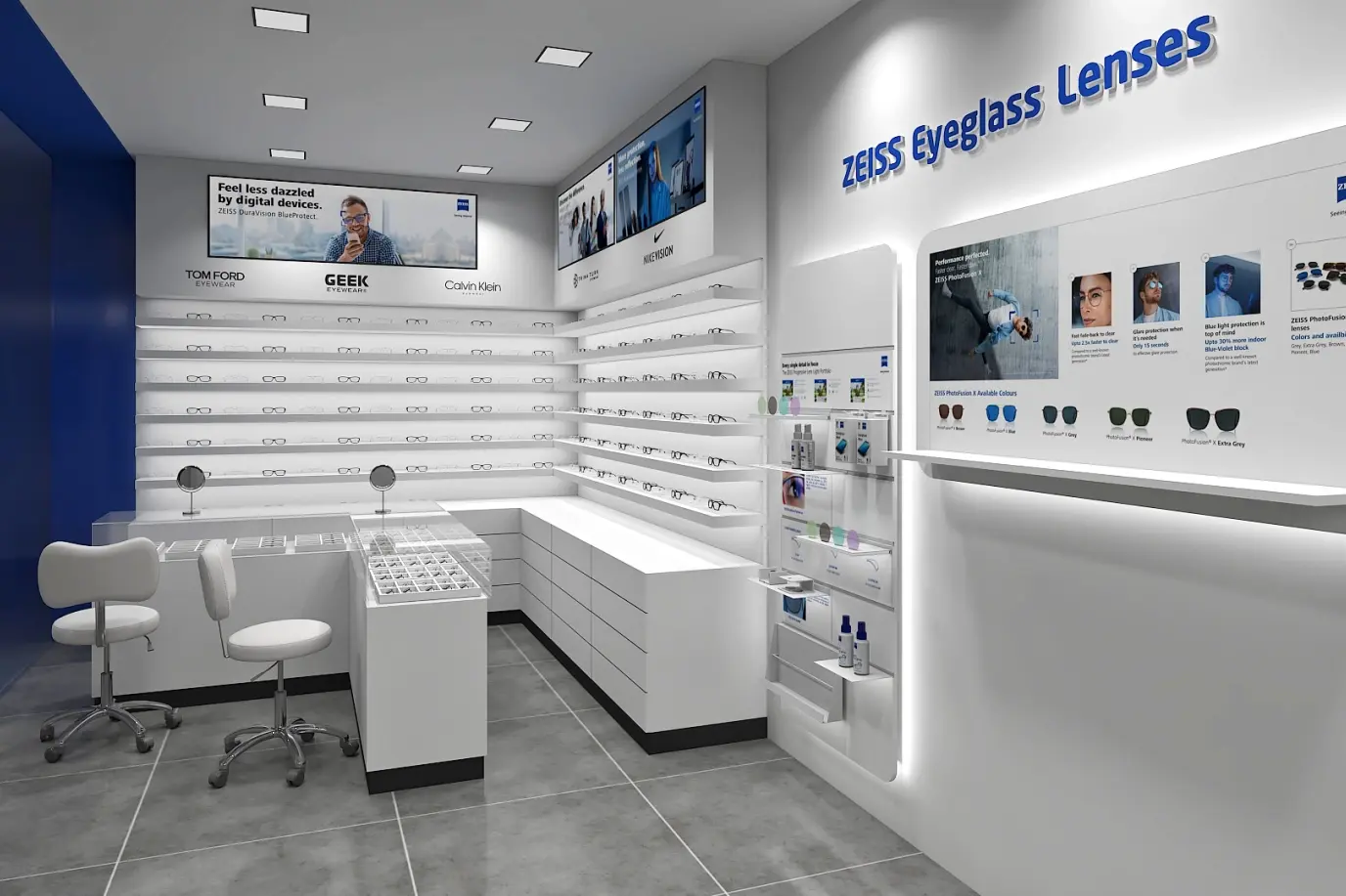
Phase 1: Counter Type Redesign
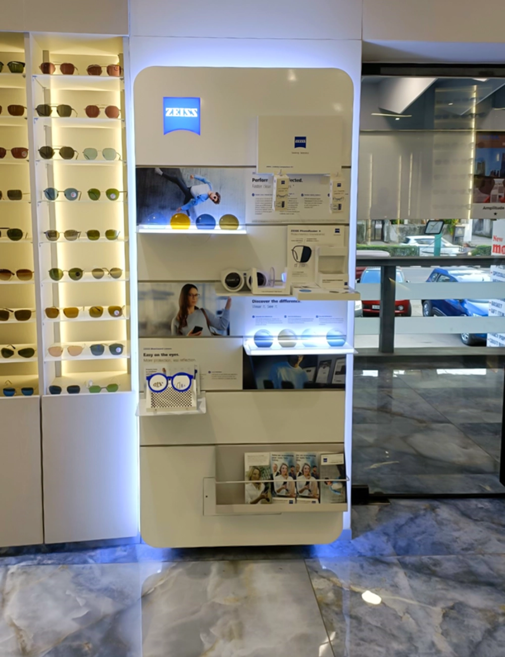
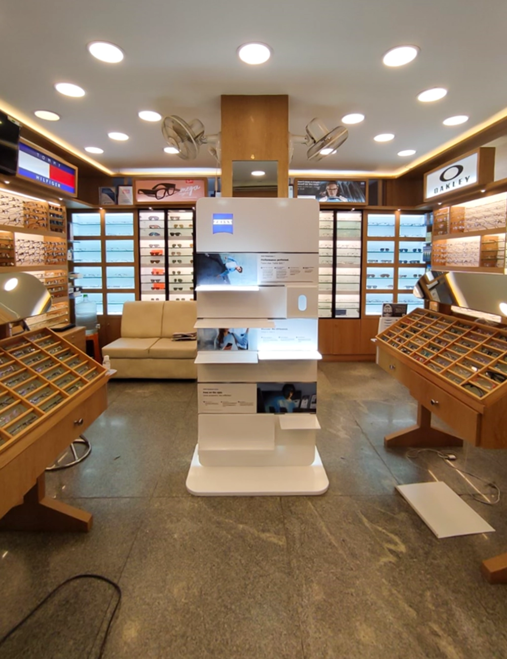
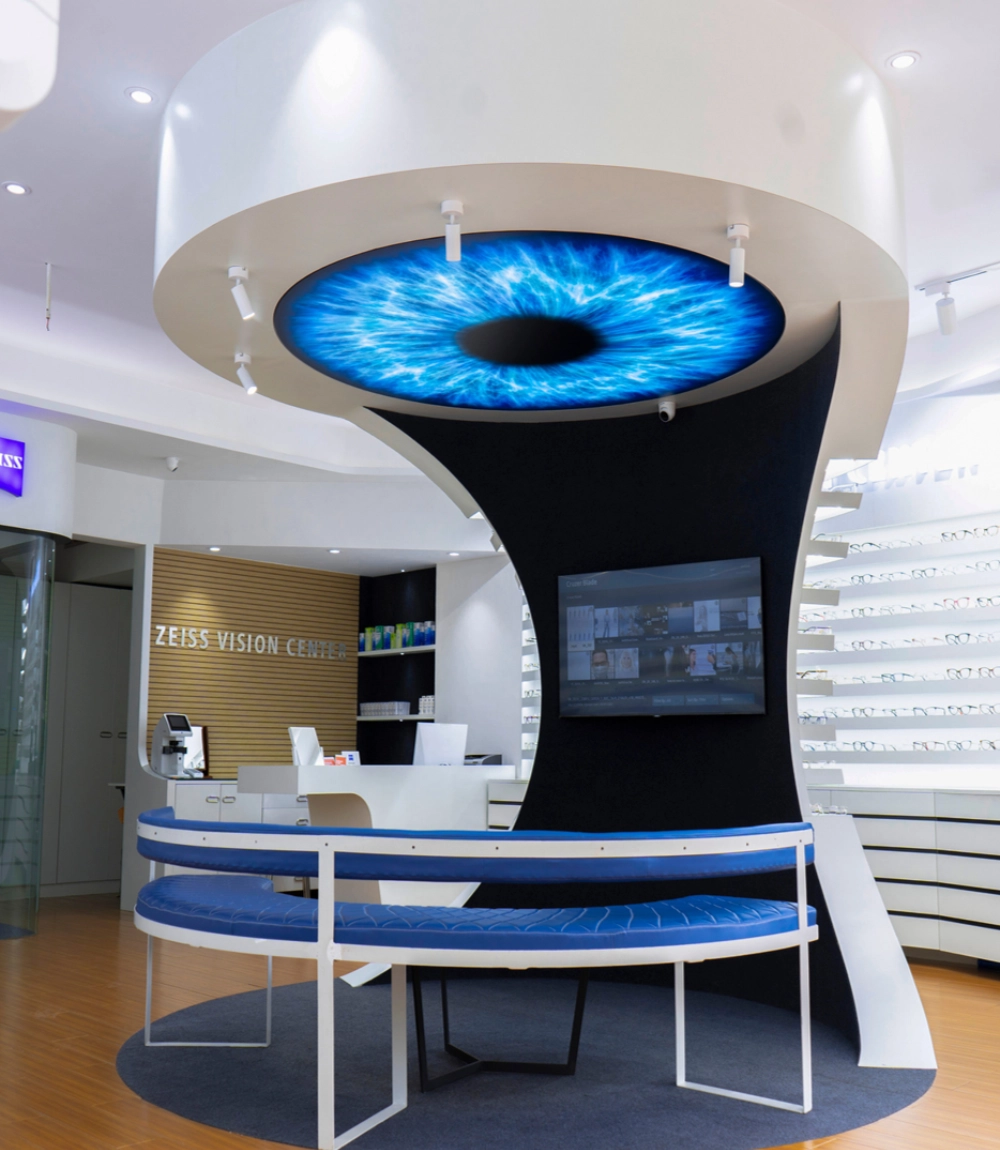
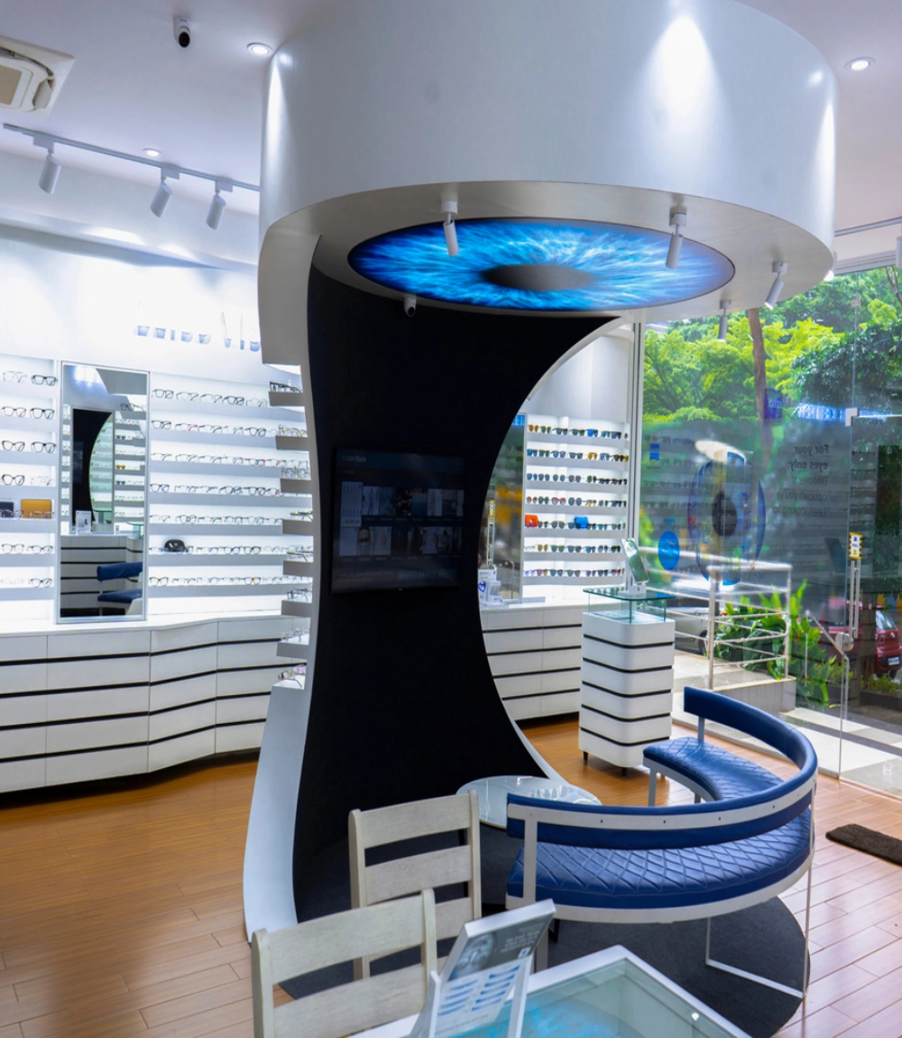
The branding agency decided to go for a range of product displays that were tailored to a variety of stock keeping units, spatial needs, and customer interaction. The conceptualized fixtures included:
These product displays were further developed in three visual merchandising formats including standalone floor standing units, wall mounted units, and island units. This step was taken to ensure maximum flexibility, irrespective of the store layout design and space availability.
| Display type | Invite | Engage | Convert |
| Frame And Lens Display Unit | The logo was strategically placed as a crown, giving it prominence within a crowded retail environment. | A central AV screen added an interactive element, keeping customers engaged with the brand and their products’ story. | Minimal product showcase enabled the customer to touch and feel the frames, fostering higher conversions. |
| Accessories Display Unit | A similar logo treatment was given to the accessories display unit in order to ensure maximum visibility along with enhanced brand recall. | An AV screen was added to grab the attention of the passersby. This automatically created an interactive experience. | The unit contained a thoughtful hanging type and shelf type stocking system that further ensured clear and organized display of products. |
| Modular Display Unit | The modular units had a loud, eye catching logo that invited interested customers by ensuring visibility from afar. | The AV screen and gamified content encouraged customers to learn more about the products and interact with the brand. | Optimized for maximum SKU display without appearing cluttered, guiding customers towards informed choices. |
Phase 2: Festive Retail Intervention
In order to identify the seasonal/festive opportunities that could enhance ZEISS’s visibility and impact through strategic design interventions, D’Art Design conducted in depth retail audits across Delhi, Mumbai, Noida, Bangalore, and other key metro cities.
Phase 3: Utility Based Branding
After conducting a comprehensive retail revamp, D’Art Design identified an unconventional but highly effective opportunity through utility based retail store merchandising.
The insight was simple. We realized that the shop owners keep materials that, in one way or another, assist them in their day to day tasks. Hence, if we integrate ZEISS’ branding into those items, they will remain in place for far longer than seasonal or campaign led refreshes.
As a result, we designed and delivered a set of functional, aesthetically aligned, and brand consistent items that blended into the store environment. A few examples include:
A vision realised at scale
From the outset, the project was meant to make a wide scale impact, strengthening ZEISS’ impact across India. Despite the challenge of working around vast geographical and retail diversity, we created a cohesive ‘ZEISS’ identity across 700+ touchpoints nationwide, while also ensuring modular flexibility to get around spatial constraints.
The balance of scale and customization helped ZEISS stand out, make the most out of festivity driven commerce, and outlast the competition's branding refresh cycles.